Skip to content

Most prosperous businesses have a specific mantra: first impressions matter. They create distinctive brand identities using unique logos and striking typographic designs.
If you want to promote your business, you may have questions about typography. The questions might be in regards to how it would help your business, and the best tactics for you to use.
To help you understand the topic better, we have compiled all there is to know about typography. Read on to find out how you can use typography to create attractive bags!
What Is Typography?
Let’s start with a fundamental question: what exactly is typography?
Typography is the technique of positioning words and letters in a way that the reader finds easy to read. You can find typography almost everywhere – from the books you read to the websites you visit.
Font style, structure, and appearance play a huge role in typography. They aim to evoke particular feelings and communicate specific meanings to consumers. In other words, typography gives life to the words we type out.
Why Should You Use Typography On Bags?
As you’re probably well aware, turning a piece of text into an attractive design is not an easy job. It calls for an effective strategy and a keen sense of visual aesthetics. I mean, it could take hours experimenting with the type of text you need to use on a product like a bag.
But have you ever wondered why we put so much time and effort into typography? Let’s go over some of our top reasons to understand better.
1) Building Brand Recognition
Typography plays a massive role in companies establishing and increasing brand recognition. Fonts make up a significant part of your brand’s visual identity. Thus, they impact how your audience perceives and remembers your business.
Think of well-known companies like Chanel or Louis Vuitton. One thought of the brand, and you can easily picture their distinct logotype.
2) Showcasing The Brand’s Personality
Some typefaces give designs a personality. Using particular typography can reveal a brand’s personality to the viewer. For example, whether it’s youthful, warm, playful and so forth. To convey the correct personality type, you will have to use text that resonates with your brand.
An example can be how people use a bold and rounded font to portray friendliness and humour. However, they use delicate typography for a sense of elegance and sophistication. With some research, you can determine what text will work well for your project.
3) Drawing Customers’ Attention
Good typography can prove to be the difference between a customer glancing at your logo for a second, or researching your site for 30 minutes. With the help of typography, your bags can be more appealing and memorable. This is the best way to get returning customers.
Typography is a quick and effective tool to bring out a particular phrase in your design. You can draw a customer’s attention by changing the colour of the text or increasing the font size.
Factors That Help In Creating An Effective Typography
Brands don’t always have to put much energy into attracting their customers. Sometimes, subtle means are enough.
Typography is one such way. But just knowing about the concept isn’t enough. You need to understand all the factors that will help your typography hit the mark.
Understanding the complexities of typography can be challenging for beginners. So, here are 5 ideas that can help make your designs look better overall.
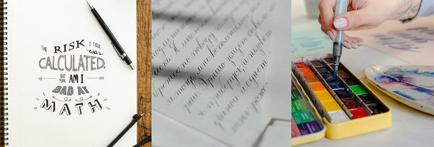
1) Font Choice
Font choice can either make or break your typography. With the many million types of fonts out there, you might be wondering which one would be the best bet for you. Most typefaces are just variations of the four primary fonts mentioned below.
Serif Fonts
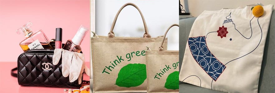
Individuals consider Serif fonts ancient and conventional. This is because people used to use Serif fonts on Roman carvings. Firms like Prada and Rolex use this font to exert legacy and timelessness.
Sans Serif Fonts
As minimalism started to gain popularity, cleaner and simpler fonts became more common. This was when sans serif fonts appeared. Bag firms such as Balenciaga and Bvlgari prefer this font.
Script Fonts
Both casual and cursive script fonts come under this heading. The formal script is much more intricate and creative – like in the case of a Cadillac or a Cartier. The casual script resembles actual handwriting. A rough but realistic look is what you can achieve with this font. You can see this in the logos of Davidoff and Ray-Ban.
Display Fonts
The most varied category of fonts is display fonts. To stand out, many companies choose to create their own font. Since they don’t fall under any category, display fonts occur in many styles. Some examples of companies making use of display fonts are Jimmy Choo and Sega.
2) Colour Combinations
Our brains are wired to respond to certain combinations of colour. One way to prove this is through this activity. Close your eyes and imagine two famous brands. It’s very possible that you were instantly able to visualise the colours of the logos. I tested myself for Starbucks and Baskin Robbins, and the colours were the first thing that came to mind.
Are you trying to conjure up a colour combination for your brand? You could encounter some difficulty with that. However, fear not! Because the colour theory has made choosing brand colours a lot easier. The secret to a fantastic design is understanding how colours interact on the colour wheel. Some commonly used colour combinations include:
- Yellow and red
- Black and yellow
- Blue and white
3) Hierarchy
Hierarchy is an essential design principle. Every feature cannot stand at the same level of a layout. Instead, lead the reader’s attention naturally across the text using a typographic hierarchy. You can make long texts more accessible like this.
The same rules apply to typography on items such as bags. You should always ensure that the headlines catch the reader’s eye first. After this, a subheading can appear, and then any other body content.
4) Spacing
Line spacing can compromise a decent typographic design. Simply put, line spacing is how you separate your text’s lines from one another. The lines are usually easier to read when you space them farther apart. As a general rule, the line spacing you use should be at least 0.3–0.5 em greater than your font size. But this can vary based on your bag design.
5) Emphasis
Emphasis is a common technique used in typography to draw attention to an important word in the text. Learning to emphasise is vital if you want to make a point.
You can employ some methods to produce typographic emphasis. Using italics, writing with capital letters, or altering the colour of the text are a few such ways. Make sure to utilise these techniques thoughtfully though. Excessive highlighting or crowding the text can defeat the aim of using emphasis.
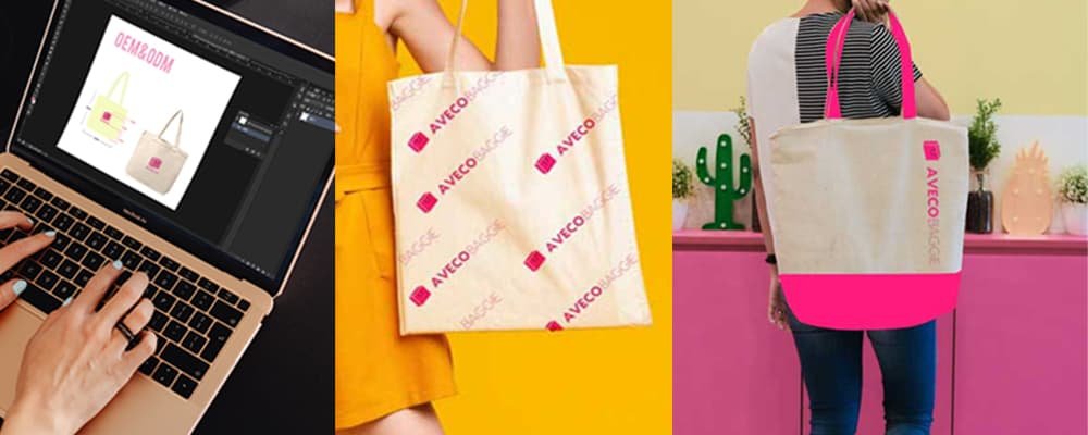
What AvecoBaggie Has To Offer
At AvecoBaggies, we present to you an array of eco-friendly bags for every occasion. With custom solutions, we can help you execute your typography for the bags in bulk. Whether it’s the colourful effect of heat printing or the embossed feel of a flock print, we offer a range of printing options to seamlessly match the look you want for your brand.
The Bottom Line
Starting a brand can be immensely challenging. But learning about typography can help you create a brand identity unlike any other. So now that you know where to start, try thinking of typographic designs to place on your bags. Your brand will lure customers in no time!